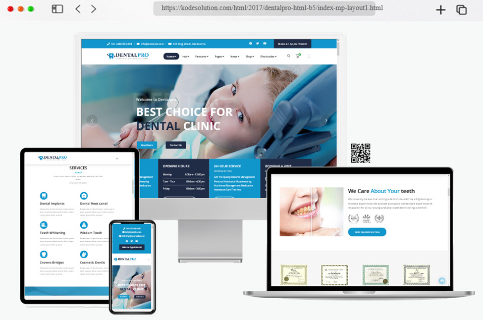
In today’s digital age, a strong online presence is crucial for any business, including dental practices. A well-designed and informative webpage can attract new patients, provide essential information, and establish a sense of trust and credibility. However, there are several common mistakes that dental practitioners should avoid when creating their practice’s webpage.
In this article, five key pitfalls to steer clear of for an effective and successful dental webpage will be looked at so that you will know what to avoid.
Overwhelming technical jargon
While it’s essential to convey your expertise, bombarding visitors with complex dental terminology can deter rather than attract potential patients. Remember, most visitors might not possess a medical background and may find intricate jargon confusing or intimidating. Instead, strive for a balance between demonstrating your proficiency and using clear, simple language. Provide brief explanations where necessary, helping visitors understand various procedures without overwhelming them.
If you have to break down complex procedures or terms, aim to make it as straightforward as you can, potentially accompanied by videos or diagrams and a friendly tone. Dental websites that have these features are undoubtedly more successful than those that are big on jargon and read like a textbook!
Lack of visual content
A picture is worth a thousand words, and in the realm of dentistry, this saying holds true. Failing to incorporate relevant visual content on your webpage can be a significant drawback. People often feel more at ease when they can visualise procedures, equipment, and facilities. High-quality images of your clinic’s premises, state-of-the-art technology, and before-and-after photos of patient cases can convey professionalism and build trust. Videos explaining common procedures or introducing your team can also create a more personal connection with potential patients.
Neglecting mobile responsiveness

In an era where people use various devices to access websites, including smartphones and tablets, ignoring mobile responsiveness is a grave mistake. A web page that doesn’t adapt well to smaller screens can frustrate users, leading them to leave your website in favour of a more user-friendly competitor that will adapt to their phone or tablet.
You need to ensure your webpage is mobile-responsive, ensuring that content, images, and functionality are consistent and easy to navigate across different devices. This consideration not only enhances user experience but also positively affects your site’s search engine ranking.
This, like a lot of things on this list, can be tricky to oversee by yourself, hence why it is worth investing in a marketing team to help you make sure that your page has this feature.
Sparse or outdated information
A common misstep is not providing comprehensive and up-to-date information on your webpage. Patients visiting your site are seeking vital details such as services offered, opening hours, contact information, and the credentials of your dental team. If you fail to update, this information can lead to frustration and cause potential patients to leave your site in search of more reliable options. Regularly update your webpage with accurate information, including any changes in services, new team members, or special promotions. An active and well-maintained webpage reflects your commitment to patient care.
Ignoring patient testimonials and reviews

Testimonials and reviews are powerful tools for building trust and credibility. Ignoring or not showcasing positive feedback from satisfied patients is a missed opportunity to instil confidence in potential visitors. Include a dedicated section for patient testimonials and encourage happy patients to share their experiences. Displaying real-life success stories can help prospective patients feel more comfortable choosing your services. Additionally, your team needs to be actively responding to both positive and negative reviews from previous dental patients in a professional manner, demonstrating your commitment to patient satisfaction and resolving concerns.
So, crafting an effective webpage requires a deep understanding of your dental patient’s or target audience’s needs. Avoiding these common mistakes—using overwhelming technical jargon, neglecting visual content, ignoring mobile responsiveness, providing sparse or outdated information, and not utilising patient testimonials—can contribute to a more successful online presence for your practice. By creating a user-friendly, informative, and visually appealing web page, you’ll be better positioned to attract new patients, establish trust, and showcase your expertise.
Remember, your web page serves as a virtual representation of your dental practice; it’s an opportunity to make a positive first impression on potential patients and convey your commitment to their oral health. By sidestepping these pitfalls and investing in a well-designed online presence, you can ensure that your dental practice stands out in the digital landscape, fostering growth and success for years to come.
